


The ISDC has a new website, brand new from the ground up… even if it looks remarkably like the old site!
The upgrade has been driven by a couple of factors. Initially a redesign was needed to simplify how users interact with the immersive sci-fi concept. As that got underway it was realised the site’s underlying content management system had become out of date and due to its age an upgrade was not going to be easy.
The ISDC’s website has always had to work hard. It covers a range functions, from promoting the concept to potential new members, facilitating collaboration, acting as a technical reference library, and providing online training. So it’s probably no surprise that the content management system powering the ISDC’s website is the same one chosen by NASA.
With a complex upgrade complete, attention could return to the redesign. The aim was to consolidate the work done on the concept over the last few years and make it more user friendly.
IRL vs Simulator
The first challenge was to manage the two distinct contexts inherent to a simulation-based concept. A visitor to the site needs to understand what the concept is and how it works, but once on board they want to be immersed in the simulation.
Moving between contexts too soon risks confusion, as the fundamentals are not yet understood. Move too late and the real-world mechanics jar against enjoyment of the simulation. To help with this transition, the new website adjusts what content is presented depending on whether the visitor is browsing anonymously and exploring the concept, or has logged in and is now within the simulated world.
In the Deep End
Feedback also suggested the old site was too dense with detail and text heavy. This is due in part to the depth of the concept - necessary to support a realistic simulation - but many members reported feeling as if they’d been ‘thrown in the deep end’.
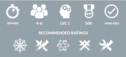
The redesign aims to guide users to the information they need by focusing on missions – each a self-contained, story-driven ‘episode’ - and what’s needed to complete them, working back into the supporting detail from there.
New Systems, New Skills
With new engineering and science systems added to the simulation over recent months, this became even more important. New systems expand the range of mission scenarios the simulator can support but need crew to be up to speed. Each system is intuitive to operate and not overly complex, but a simulator will always need a little more technical context in ways that an off-the-street experience like an escape room doesn’t.
The new design aims to help with this using a new skills framework. Iconography clearly identifies the skills needed by a mission scenario and those each crew member has mastered via the Academy, which provides short online courses for each skillset.
Virtual Careers
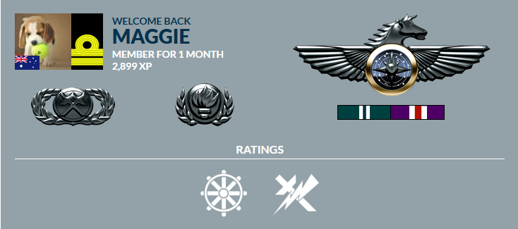
The implementation of a new XP points system makes it easier to track experience gained from completing missions.
Experience is rewarded with career advancement and crew can now see exactly how many XP they need to step up to the next level in their virtual careers. Each user’s profile presents this visually in the form of the badges and rank insignia earned.
With the website upgrade complete, the focus is now on continuing the rollout of remaining ship systems and adding new missions to take advantage of them!