


Related
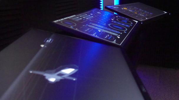
The Vessel Command, Control and Management System (VC2MS) is intended to facilitate intuitive access to relevant system information for rapid diagnosis and control input.
The system uses touchscreen interfaces to maximise configurability, meaning any system could be controlled from any console on the ship.
Hardware
The VC2MS is accessed physically via groups of touchscreens.
Screen
A screen is an individual touch screen which has its own Standard Compute Unit (SCU).
Each screen can be configured to display a selectable control interface panel (see software below).
Console
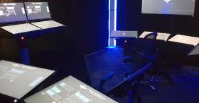
A console is a group of panels mounted together. The number of panels reflects the functional requirements of the system being controlled, with a number of standard configurations also reflecting the environmental context of the console’s location. For example, on the bridge the configuration of consoles reflects the need for operators to confer with each other.
Software
Hardware screens display software for the monitoring and control of vessel systems.
Panel
A panel is a pre-configured group of software control inputs and data visualisations displayed on an individual hardware screen (see above) for the management of a particular vessel function.
Panel layouts are modular, reusing functional components to ensure consistent operation, while providing for specialist capability where needed.
The interface aims to communicate critical information clearly for rapid visual assessment. Control interfaces are designed to simplify system operation, supported by automation and integrated AI.
User Interface
A consistent ‘design language’ across all systems assists with accuracy of data assessment and ease of operation.
A wide range of reusable and specialist functional modules are available for interfaces. Even though they may have widely varied functional designs they all adhere to a number of common visual protocols and layout devices.
Visual Protocols
Colour is used across the VC2MS as consistently as possible. There are a number of protocols which describe the appropriate use of colour in different functional contexts.
Layout Devices
A number of common visual devices assist with interface layout and usability.
Visualisation Frame
A simple frame consisting of three corner markers and a triangular button is used to present visualisations, which can be in the form of graphs, 3D models, maps, data, etc. The frame may also used around a large group of control and data display modules, especially where configuration functionality associated with the group is needed (see below)
A frame label at the bottom left describes the function of the framed components.
A visualisation can be presented as a core part of a console panel or as a modal overlay.
The triangular button is tapped to access configuration or extended functionality. If the visualisation is a modal overlay, the triangular button closes the overlay.
Functional Group
A functional group includes one or more control and/or data display instances which are related to a particular system function.
The group is contained within a continuous frame with a label describing the group’s function at the top right.
Button Gangs
A group of buttons related to a common function are surrounded by a frame, with a label describing the gang’s function at the top-left. Gangs may be presented vertically or horizontally.
Single Select
Each button within the gang acts independently, each controlling a component or aspect of a common function.
Radio Format
Buttons have interrelated functionality, usually as a range of options for a single function of which only one can apply at a time. Tapping one button deselects the currently active button in favour of the tapped button.
Indicators
Buttons may primarily be used to indicate the current status of related system components (such as master alarm gangs). Tapping the button simply displays additional status information.
Data Display
Data can be displayed in any number of ways depending on the module used.
Basic data display in numerical or word form has a common format.
Datapoints
A datapoint may have a number of visual components.
Data Display
The actual datapoint is displayed in mid-blue using the stylised font.
Datapoint Label
A label describing the datapoint may be displayed above/left or inline before the data. This will be in white using the simple font.
Unit of Measure/Suffix
A Unit of Measure (UOM) or suffix may be displayed inline after or below/right the data.
Direct Data Input
Where a numeric display accepts direct data input via a keypad, this will be indicated by the datapoint displayed in white against a light-grey background. Tapping the datapoint opens the input keypad as an overlay for data entry.
Control Inputs
There are two core control input types.
Buttons
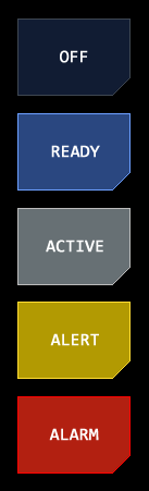
The simplest input is a button, which typically has a Boolean function – the system is either active or inactive.
Buttons may have different selection types.
Toggle
Each tap of the button swaps between two states and remains on that state until tapped again.
Push
Tapping the button initiates the control function and after a short confirmation the button returns to its nominal state.
Hold
Tapping the button initiates the control function and remains engaged until tapped again.
Indicator
The button is used to indicate the status of a system component. Tapping the button simply displays additional status information.
Button Status
The button’s colour and text label may change to indicate the current status of the control function.
Button colour indicates one of five possible states, described in the standard status display protocol.
Sliders
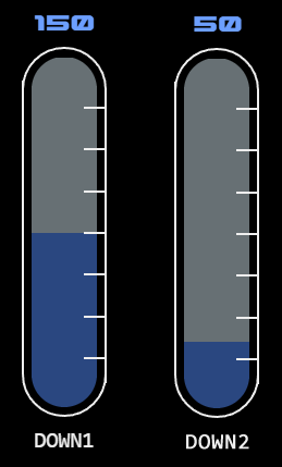
Sliders allow the selection of a value within a range, such as when applying power to a system.
The length of the slider represents the available range, represented by a grey background.
The area between the base of the slider and currently selected value is shown in blue. The current value will also be displayed numerically.
A tap-hold at the top of the blue selected area and sliding will move the top of the selected area in that direction, following the current position of the tap-hold. Lifting off the slider will select the value at that point.
Linear Slider
Linear sliders allow a vertical or horizontal selection along a straight track. These are typically used for power inputs for major systems as they are easier to use accurately.
A graticule overlays the right of the slider showing increments from 20% to 80% of range.
A label at the bottom of the slider describes its function.
Radial Slider
Radial sliders allow selection around a circular track. They are used to save space or where the form factor is otherwise more suitable (for example where the position of the selected point has particular visual significance).
Radial sliders should not be confused with navigation radials which have similar functionality but have visual/functional differences and are specific to navigation.
Indicator Mode
Radial sliders may be presented as indicators only, with no input function. This is typically used for progress display.
An additional thin line around the main track shows the radial in in indicator mode. Typically, only the selected (blue) track is shown in this mode, not the grey (range/background) track.
Jog Mode
A round blue indicator is presented in place of the active/selection range. Tap-hold and sliding the indicator changes the control input value in the applicable direction.
In this mode the control input value is not limited by the slider’s range – multiple circuits of the track are possible to keep increasing/decreasing the value.