
Radial Monitor Module
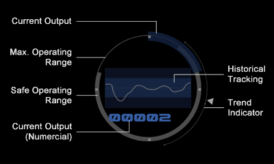
 The Radial Monitor is a core data visualisation, so named because its design is based around a circle. This approach allows a greater data range to be displayed compactly.
The circle represents the full operating range of the system being monitored, starting from the top. Multiple layers of information are displayed over this circle, including the safe operating range for the system (in grey) and the current operating level (in blue). The current operating level is also shown numerically.
From this the crew can tell at a lot about the system’s current operating parameters at just a glance.
Data density is further increased by displaying historical tracking data in the space at the centre of the circle. An outer arc with a triangular status indicator also tracks operating trend, showing whether the system’s average trend.


